Colors are more than just visual stimuli; they have profound effects on our emotions, mood, and physical energy. From the vibrant hues of a lively city street to the calming shades of a natural landscape, understanding how colors influence happiness and vitality can help us create environments that promote well-being. This article explores the science behind color perception, cultural differences, and practical ways to harness colors to enhance daily life.
Table of Contents
- Introduction to the Influence of Colors on Human Emotions and Energy
- The Science Behind Color Perception and Mood Regulation
- Color and Energy Levels: A Closer Look
- Cultural and Personal Variations in Color Perception
- Practical Applications: Designing Environments to Enhance Mood and Energy
- The Natural Connection: How Nature Uses Color to Affect Mood
- The Non-Obvious Aspects of Color and Energy — Deepening the Understanding
- Future Perspectives: Harnessing Color Psychology for Well-Being
- Conclusion: Integrating Color Awareness into Daily Life for Enhanced Happiness and Energy
1. Introduction to the Influence of Colors on Human Emotions and Energy
a. Overview of psychological and physiological responses to color
Research shows that colors can evoke specific emotional responses and physiological changes. For example, warm colors like red and orange tend to increase heart rate and stimulate excitement, while cooler shades like blue and green promote calmness and relaxation. These reactions are rooted in our evolutionary history; bright, intense colors often signal danger or food, prompting alertness, whereas soothing hues are associated with safety and serenity.
b. Importance of understanding color effects in daily life and environments
Incorporating an awareness of color psychology can improve our surroundings—from workplaces that boost productivity to homes that foster relaxation. For instance, hospitals often use calming blue and green tones to reduce patient anxiety, illustrating how subtle color choices influence emotional states and energy levels.
2. The Science Behind Color Perception and Mood Regulation
a. How the brain processes colors and their emotional associations
Colors are processed in the visual cortex, but their emotional significance is primarily linked to the limbic system, which governs feelings and memories. For example, red can trigger excitement due to its association with blood and danger, while yellow often evokes happiness as it resembles sunlight. These associations are learned and reinforced through cultural and personal experiences.
b. The role of dopamine release triggered by certain colors, such as candy hues
Research indicates that bright, saturated colors—like those found in candies or playful environments—can stimulate dopamine release, the neurotransmitter linked to pleasure and motivation. When individuals encounter such colors, their brain’s reward pathways activate, contributing to feelings of joy and increased alertness.
c. Biological mechanisms linking color stimuli to happiness and alertness
Physiologically, exposure to certain colors can influence hormone levels and nervous system activity. For example, exposure to warm colors may increase heart rate and adrenaline, heightening alertness, while cooler tones can lower cortisol levels, reducing stress. Understanding these mechanisms allows for deliberate design of environments that promote desired mood states.
3. Color and Energy Levels: A Closer Look
a. How bright and saturated colors can boost energy and motivation
Bright, high-saturation colors such as neon yellow or vivid red are often used in gyms or classrooms to stimulate activity and focus. These hues activate the sympathetic nervous system, making individuals feel more energized and ready to engage in physical or mental tasks.
b. The impact of warm vs. cool colors on perceived energy and calmness
Warm colors like orange and red tend to increase perceived energy and warmth, fostering enthusiasm and motivation. Conversely, cool colors such as blue and teal promote calmness and can even reduce feelings of fatigue, making them suitable for relaxation spaces or work environments requiring focus.
c. The influence of color intensity and context on physical activity and productivity
Intense colors are more stimulating, especially in environments that demand alertness. However, overuse can lead to overstimulation and fatigue. The context matters—an upbeat red in a sports arena energizes athletes, while the same color in a bedroom might hinder relaxation. Balancing color intensity with purpose enhances both physical activity and productivity.
4. Cultural and Personal Variations in Color Perception
a. How cultural backgrounds shape emotional responses to colors
Colors carry different meanings across cultures. For instance, white symbolizes purity in Western societies but signifies mourning in some Asian cultures. Red may evoke luck and celebration in China but can also signal danger elsewhere. Recognizing these differences is vital when designing inclusive environments or products.
b. Individual preferences and experiences influencing color effects
Personal history and sensory sensitivity influence how one perceives colors. Someone who associates blue with childhood memories of calmness may find blue spaces more relaxing, whereas others might perceive the same color as cold or distant. Personalization can optimize environments for emotional well-being.
5. Practical Applications: Designing Environments to Enhance Mood and Energy
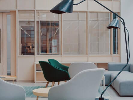
a. Interior design principles for creating uplifting spaces
Using a palette of warm, bright colors with balanced contrasts can foster an energetic and positive atmosphere. For example, incorporating accent pieces in cheerful shades like yellow or coral can stimulate creativity, while neutral backgrounds prevent overstimulation. Light-colored walls paired with vibrant accessories are a popular approach.
b. How urban architecture can leverage color to influence community happiness
City planners increasingly use color in public spaces—painted benches, murals, and building facades—to create inviting environments. Brightly colored community centers or parks encourage social interaction and uplift mood, contributing to a sense of vitality and community pride.
c. Case Study: My Sweet Town and the use of candy colors to evoke joy and liveliness
In the modern illustrative example of My Sweet Town, developers use a palette of pastel and candy-like colors to create a joyful, energetic environment. Such color schemes leverage the psychological impact of bright, saturated hues to foster feelings of happiness and social engagement—demonstrating how intentional color use in design can influence mood on a community level.
6. The Natural Connection: How Nature Uses Color to Affect Mood
a. The role of natural landscapes and seasonal changes in emotional well-being
Natural environments rich in green foliage or blue skies are universally associated with relaxation and vitality. Seasonal changes, such as spring blossoms or autumn leaves, can influence mood—elevating happiness during blooming seasons and fostering reflection during fall.
b. Examples of how specific colors in nature (e.g., green, blue) promote relaxation and vitality
Green, symbolizing growth and renewal, is shown to lower stress levels, while blue, often linked to the sky and water, enhances calmness. Studies indicate that spending time in green spaces or viewing blue horizons can significantly improve emotional health and physical vitality.
7. The Non-Obvious Aspects of Color and Energy — Deepening the Understanding
a. The heat reflection properties of different colored surfaces, such as pink buildings reflecting more heat than dark ones
Color impacts thermal properties; lighter colors like pink or white reflect more heat, keeping buildings cooler and potentially influencing comfort and energy consumption. Conversely, dark surfaces absorb more heat, which can increase cooling costs but may also subtly affect mood—darker environments might feel more cozy but less lively.
b. The subconscious influence of color combinations and contrasts
Color contrast can draw attention or create harmony. Complementary colors, such as blue and orange, increase visual stimulation, while analogous schemes promote calmness. These subconscious effects influence behavior, focus, and social interactions.
c. The potential for color to influence behavior beyond immediate perception, including long-term mood shifts
Long-term exposure to certain color environments can reshape emotional patterns. For example, workplaces with energizing colors may improve sustained motivation, whereas soothing hues may reduce chronic stress. Recognizing these subtle influences guides effective design choices.
8. Future Perspectives: Harnessing Color Psychology for Well-Being
a. Emerging research on personalized color therapy and environments
Advancements in neurofeedback and biometric data enable tailored color interventions—adjusting lighting or visual stimuli based on individual emotional responses. Personalized environments could optimize mental health and productivity.
b. Technological innovations in lighting and display for mood regulation
Smart lighting systems now adapt color temperatures and hues throughout the day, aligning with circadian rhythms and emotional needs. Virtual and augmented reality platforms also explore dynamic color environments to enhance well-being.
9. Conclusion: Integrating Color Awareness into Daily Life for Enhanced Happiness and Energy
a. Practical tips for using color intentionally in personal and shared spaces
Choose bright, warm colors for areas requiring energy and social interaction, such as kitchens or gyms. Use calming blues and greens in bedrooms or meditation spaces to promote relaxation. Incorporate color psychology principles when decorating or designing work environments to boost motivation and reduce stress.
b. Reflecting on the role of colors in fostering a joyful and energetic community environment
“A thoughtful application of color in urban and community design can cultivate happiness, vitality, and social cohesion, transforming everyday spaces into sources of joy.”
By understanding and intentionally applying color psychology, we can improve not only individual well-being but also the collective energy of our communities. Whether through personal choices or urban planning, colors hold the power to uplift and energize us all.


Add comment